Sharing is caring!
This site has affiliate links where I earn a commission that enables me to run the site.
What is E-commerce?
E-commerce refers to buying and selling of goods and services through the internet.
The e-commerce site carried out its first sale in 1994. A man sold a CD online for $12.28.
Global retail projects e-commerce sales to rise to $12.48 Trillion in 2020.
Example of e-commerce
- Retail: sells direct to customers
- Wholesale: deals in bulk
- Dropshipping: Sales product manufactured and shipped by third parties.
- Crowdfunding: Raise start-up capital online
- Subscriptions: deals in recurring purchase
- Physical products: Sells physical goods
- Digital products: Sells downloadables and courses
- Services: Provide skills at a fee.
To create your e-commerce website. Choose Shopify that powers 21% of e-commerce sites.
10Things to Do to Improve Your Ecommerce Store
1.Design a nice logo
Your Logo builds the foundation of your brand. It makes a strong first impression. This is what makes a good logo. it’s recognizable, It’s adjustable looks good big or small. Stands out and captures the viewer’s attention. Looks good either on the web or on print materials. It relates to your work.
Use Hatchful, a logo maker app to design stunning logos. It saves you time. It’s easy to use no design skills required. Choose designs from 100 templates and color combinations to customize your logo.
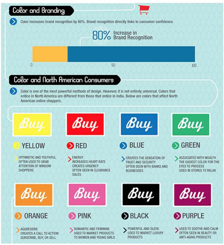
Colors mean a lot in logo design. Choose colors that evoke customer emotions. People react to different colors. If you choose red it shows urgency. Purple means loyal, Blue symbolizes freedom, Green shows safety. Determine the color scheme that suits your business.
To get a feeling of the best logos. See the examples below.



See how they use simple words and readable fonts.
2.Optimize for mobile
More people are using mobile to shop than desktops.
Mobile commerce will control 73% of global e-commerce by 2021.
In the last six months, 79% of customers used mobile to shop.
For instance, in 2018 Black Friday Cyber Monday( BFCM) more sales happened on mobile.
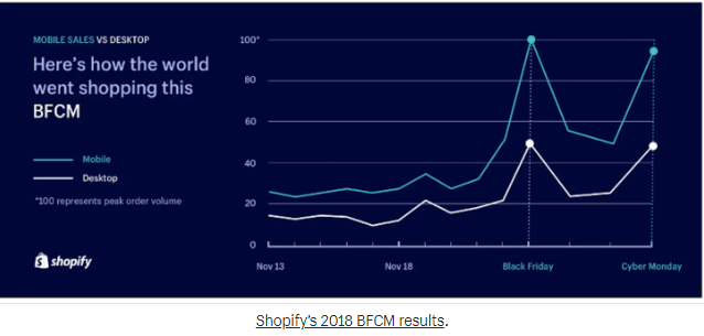
As a site owner, you have to optimize your site for mobile use.
Start by checking using this Mobile-Friendly Test app.
Mobile-first vs responsive design
Responsive design changes to fit desktop, tablets, or mobile. The design is first created for desktop then fitted to other screens.
Whereas mobile-first design is a lean, mean mobile design. Created and enhanced for mobile use.
To make your e-commerce site fit for mobile use. Aim on visual hierarchy show featured products and items on sale first.
Avoid large chunks of text. Then make communication friendly using Snapchat, Instagram, WhatsApp that integrate well with mobile. Also, make elements clickable.
3.Organize the homepage
Ever tried to look for items in a cluttered supermarket? Where everything appears to be out of place.
You feel tired and wasted especially if there are no shop attendants to help. The next thing you do is walk out and try another shop.
The same happens to e-commerce sites.
If you have a crowded and messy homepage. It makes it hard for visitors to navigate. Hence leave to another site.
Online shoppers are always in a hurry and scan through to find products. So if you don’t grasp them with the first impression they are gone forever.
Work on your homepage. Make it simple to accommodate visitors looking for a specific outcome. Add content that inspires action. Have clear navigation.
Use eye-catching images. Include a direct call to action. Have an easy to apply shopping cart. Include a search bar to locate items. Finally, add social proof.
4.Include Call to Action
You have a stunning e-commerce site. But why ain’t visitors buying? You have even gone ahead and advertised your store its getting traffic. But you still get no sales.
The problem is that customers are having a hard time navigating your site. You don’t have Call to Action (CTA) buttons to guide them on what to do and what to buy.
How do you make CTA effective? This is by adding urgency to show that your discount is for a limited time. The fear of missing out (FOMO) makes visitors commit to buy fast.
Test with different colors red, blue, black. Place the CTA above the fold the part that comes down after scrolling down. Any content placed above the fold is visible. Design a medium-size CTA button.
Example of CTAs.
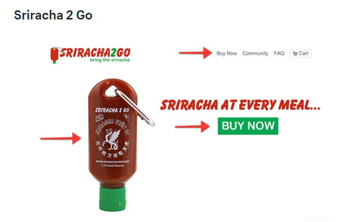
Why does it work?
Shows where to click. Displays how the product looks. Places CTA is above the fold.
5.Have a clear search field
Do you get frustrated when you visit a store only to search everywhere for products? The site is hard to navigate. You want to find products fast.
Using the search function makes it easy to navigate your store. The search field enables visitors to search for products, articles, and pages. The more complex your store is the more you need to have a clear search process.
Prioritize important pages and products on sale. Hide sold out products. Restrict search results to product pages. Customizing storefront search results can be a powerful tool to enable conversion. Customers get to access available products and filter out unnecessary content.
Configuring your search field gives your visitors a better experience. It enables you to find what they are looking for faster and in a nice way. The search bar statistics give information about your visitors. You can use these analytics to customize your search.
6.Display special promotion
Everyone loves discounts, offers, and using coupon codes. Right? You are always searching for shops with the best deals. Where to get dollar value.
Special promotion increases customer loyalty. Discounts increase conversion. It helps to move products fast. It helps meet sales goals.
Special promotion will assist drive customers. But if you do it in a haphazard way it damages your brand and leads to worse being unprofitable.
You can offer percentage-based discounts. Give free gifts. Offer dollar value discounts or offer free shipping.
Discounts to offers include:
- Weekly/monthly discounts
- Holiday and seasonal deals
- Email subscription offers
- Referral promos
- First-time shopper offer
- Retargeting promo
- Event attending offer
Shopify offers a range of free and premium discount Apps.
Wheelio is a great example.
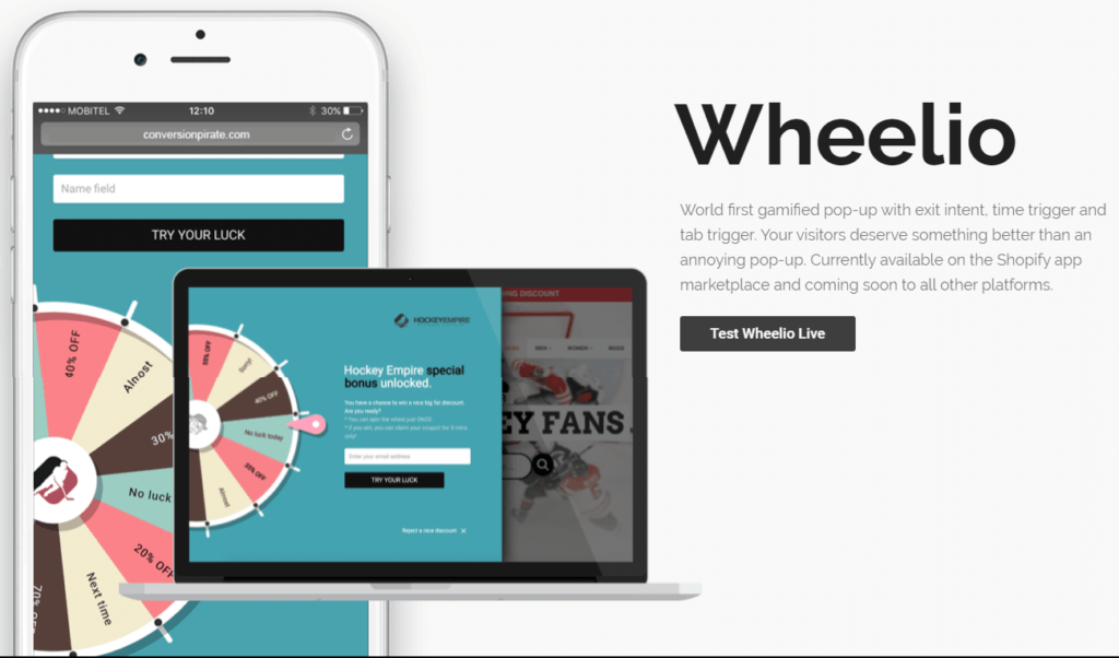
Why does it work? It gamifies the shopping experience. When you spin the wheel it gives you a chance to win a big discount.
7. Add high-resolution images
Pictures speak 1000 words. Images build the foundation of e-commerce. The better the images your store the more the visitors.
The hero banner image that appears on the home page communicates a lot about your brand. It tells your story of how you started and what you believe in. The hero image gives answers to customer questions. It displays your value proposition.
You can use the images to make announcements. Used to feature products and product lines. When designing the hero image keep the content simple so that readers can understand.
Keep the image file small so as not to slow down your loading speed. Use a few image slides to avoid distractions.
Where to get images
Here is where to get royalty-free images at no cost.
If you have the budget you can source paid pictures from.
8. Use user-generated content
Imagine you can engage your customers and volunteers to create marketing content. The good thing is that they will do it for free.
Content produced includes photos, videos, and reviews.
This is user-generated content (UGC). It’s produced by people who interact with your products and services. The content is not made by your brand.
Customers can share videos on their unboxing experience on Youtube. They can share reviews on third-party review sites like Yelp. Or post product images on social media.
UGC saves your time. It expands your customer reach and helps you create an engaging community.
People trust people more than brands. UGC builds trust as people find out from the customer’s point of view.
Embed UGC content on your e-commerce site. Repost UGC content on social media uses it to do retargeting marketing.
User-generated content taps on the natural voices and collective power of your community.
9. Add security badges
It’s important to protect your customers from fraud. Cybersecurity is on the rise.
63% of IT firms say their data got compromised within the last 12 months by a security breach. Hackers are trying to swindle online shoppers day and night.
Many people are not comfortable sharing their credit card information with anyone. So how do you address security concerns?
To combat security use a secure e-commerce platform like Shopify. That has security experts that watch your site 24/7.
Add Shopify approved security boosting apps like Trust. Which adds an extra protection layer. It also informs customers by displaying security badges on your site.
Offer different payment options. Make customers have control over their preferred payment options. Many also prefer to use PayPal as its renowned secure financial gateway. Others prefer to use Visa, Mastercards, Applepay, and AmazonPay.

10. Add social proof
How do you create trust and authenticity to our customers? By showing social proofs.Right? New customers are hard to convert. They want proof from other customers. They want unbiased reviews from independent sites like Yelp or Facebook. Social proof. validates that the product is worth the customer’s time, and money. Using other people’s proof.Social proof shows
Popularity
It displays the number of likes, comments, views, shares on social media. It shows the number of subscribers on live broadcast Facebook or YouTube.

For instance, a Facebook page with 57k likes looks more established than the one with 500 likes.
Public praise
85% of customers are trusting local reviews more than reviews from marketing materials.
Encourage your customers to write reviews,user-generated content, and ratings. Post them on open forums like Yelp and Facebook
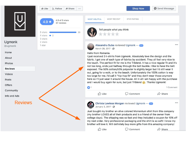
Endorsement from trusted experts
Use micro-influencers to share content on their site or social media.

You can use social proof on your blog post, emails, PPC campaign, social medial. Or use it on your site.
Use these apps to create stunning social proof.
Sum It Up
In a nutshell, we have reviewed 10 areas that need your attention.
To keep you on the loop download the ultimate checklist. Use it to update your website. You will indeed thank me later.
Do you want too to create a stunning e-commerce site? Choose Shopify the best e-commerce platform.
Share the love and leave a comment.


This article is really a fastidious one it helps new net people, who are wishing for blogging. Tova Bobby Kacie
Hi there, after reading this amazing paragraph i am as well glad to share my familiarity here with colleagues. Doris Hilly Moretta